On November 22nd, we’ll be saying goodbye to Course Themes. This means that instructors will no longer have the ability to change the colour of the background of their papers, or to change the style of their menus. On the other hand, instructors will still be able to set their own banner image on the paper and arrange the menu items according to their preferences.
We are making this change because currently only one theme in the upcoming version of Blackboard is fully mobile compatible. So, essentially, we were faced with a choice: either we can allow the freedom to choose colour and menu schemes, or we can stick with one theme across the board, which brings the benefit of a greatly improved Blackboard experience on mobile devices.
Mobile Compatibility is something that students have frequently asked for. Our discussions with Student IT and OUSA were pretty unanimous when given the choice of variable Course Themes or the ability to use Blackboard on their phones. This student feedback significantly influenced our decision.
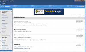
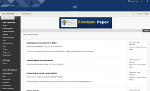
So what does the new theme look like? Let’s look at a comparison on a desktop computer:
As you can see the general layout stays the same. The blue colours from the first example are the main thing that changes.
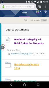
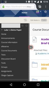
On mobile you have the ability to open and close the menu. Text will be a bit larger for mobile users and easier to read.
These changes have been made with support from the Web Services team.
We’ll have one more blog on the Upcoming Changes to Blackboard dealing with which known issues should be fixed by this update.
Key Dates:
- 22 November 2017 – Blackboard Update.
- Blackboard will be offline after 5pm


