A sense of style…

Friday, April 27th, 2018 | EMILY HALL | No Comments

I was browsing the internet the other day, as you do and ran across this video. I’m not a natural history film person in general and I don’t watch natural history documentaries very often because to be honest I find the traditional documentary style a bit boring. I did like this though and it made me think about different approaches with the same message or aim.

I typed “frogfish documentary” into the search bar of google and was rewarded with many short films about frogfish.  Here are a few examples which I have divided based on my own interpretation of the type of presentation style:

All of these examples have pictures and videos of frogfish and all have very similar content in terms of facts about frogfish. The difference is in the style of presentation. The kids one is very clearly aimed at kids but we could argue that the other two are both aimed at similar audiences, adults. The styles they are made in though are very different.

Looking a bit further, documentary films in general can be divided into 6 categories or modes according to American documentary theorist Bill Nichols.

  • Poetic modethis is an early form of documentary that tends to be more subjective and evoke a feeling, mood or tone
  • Expository mode- as time moved on, documentary makers started looking more at the social problems of the word and expositional images paired with narrative. This is more like a David Attenborough type nature film in that it is meant to transfer information
  • Participatory mode – in this type of documentary, the filmmaker interacts with the subjects by asking questions for example. The participation of the filmmaker is known to the audience (by hearing the interviewer’s voice off camera for example)
  • Observational mode – In contrast to the participatory mode, the observational mode is like a fly on the wall style documentary – simply watching animals in their natural habitat
  • Performative mode – This is similar to the participatory mode because the filmmaker interacts with the subjects but unlike that mode, in performative mode, the filmmaker is also trying to convey a message or particular story. The performative mode is less objective and more subjective.

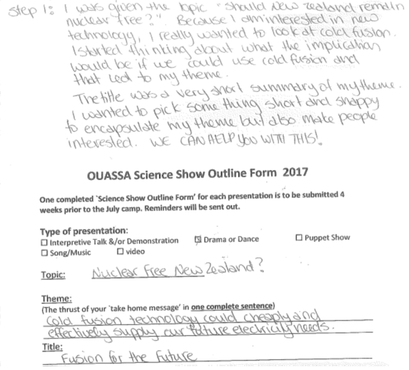
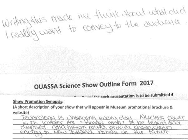
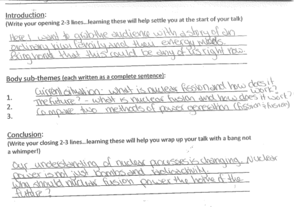
Our OUASSA students are producing shows, talks, films and written works for public presentation at the New Zealand International Science Festival in July. Thinking about the audience that will be at the presentations and how best to reach them will be key to getting their messages across. The style of show, talk, film or writing will be just as important as the medium and information.

Putting pen to paper…

Tuesday, May 30th, 2017 | EMILY HALL | No Comments

For this week’s blog, I thought I would look at an area that many OUASSA 2017 teams seem to be struggling with, breaking up the work for the team presentation. I have put myself into the roll of the team leader. I wrote up the presentation outline (which I did alone but really the team leader should be doing this with input from their group) and then I thought about how I would break up the work of the presentation to a hypothetical group of 6 team members. I picked 6 because that 7-9 is the group size for our OUASSA 2017 students.It didn’t actually take me very long to think about the outline and write it out. The most important thing to remember at this stage is that it is a work in progress. As we research and craft the presentation, some of the things I have written on my outline may change, and that is ok. It is a guide to myself and my team for where we are generally heading with our presentation. Having a good outline will ensure that my team is on task and not wasting time on research we won’t be using for our presentation. It also helps everyone in my group have a clear idea of what the big picture will look like, and where their piece fits in.

So on to the mechanics of it. I wrote what I was thinking each step so hopefully my handwriting is legible to all 🙂

The final step was filling in the rest of the form. I thought about what I needed people to understand to convey my message. I need people to understand what is fission, fusion and the difference between them. I have a really broad idea of how I want the introduction and conclusion to look but it’s not finished yet. For a first draft, this is totally fine, we’ll come back and tweak this while developing the presentation.

Finally, how will my group divide the labour so that we do the work that needs to be done but don’t waste time on anything else? This is what I came up with:

  • 1 person will write a brief introduction to the talk as a story with an ordinary kiwi family. This should only be a minute or so long so emphasis on BRIEF.
  • 1 person will research fusion and come up with a brief explanation to report to the team
  • 1 person will research fission and come up with a brief explanation to report to the team
  • Once that is done, 1 person will do a 1 minute compare and contrast summary
  • 1 person will use the research to do our visualisations of each concept
  • 1 person will write the conclusion

We will manage everyone’s ideas and contributions in a google doc that we can all contribute to. I know that some of my team are really busy with winter sports in June so they will do the research so that their part is finished early on. Those of us not as busy closer to camp will do the parts that depend on the research.

At camp we will rehearse our visualisations together and tweak our presentation before we show our presentation to the panel for feedback. This shouldn’t take long if everyone has done their part.

I have attached my full outline form: ScienceShowOutline.

Hopefully this will give you guys a bit more guidance on how to distribute the labour and what we expect you to be doing. Remember, we are only an email or phone call away if you need any help.


Dancing about Science…

Wednesday, April 12th, 2017 | EMILY HALL | No Comments

Fun, interactive, and engaging Science?

I was looking at some research into Science shows and came across some key findings on how to engage children from Science Museum (UK) focus group research undertaken in 2010:
• Audience participation is regarded as crucial – if children aren’t involved, they may lose interest.
• Parents like young, casually-dressed presenters, rather than the stereotypical white-coated ‘nerd’; they feel an informal approach is important in removing barriers to children’s appreciation of shows.
• The three words they felt would most attract their attention in descriptions of the show were Fun, Exciting and Interactive

For this week’s blog post, I tried to look for some novel ideas on how to present Science to an audience. Keeping in mind those ideas from the focus group on keeping it fun, exciting, and interactive.

One really amazing thing I found was Biology for the blind and partially sighted. Using 3D printing to bring the microscopic world to people who otherwise wouldn’t have any experience of it. Definitely worth watching, especially the audience reactions to being able to interact with the microscopic world for the first time in their lives!

For another novel presentation method, check out this TED talk about dancing scientific concepts which includes, among other cool things, a great example of the difference between ordinary light and lasers using dancers. The 2016 winners of the contest that he mentions “Dance your PhD” are also worth a look. I particularly liked the people’s choice award winner.

I have already shared with you what I think of as some good examples of story telling in Science Communication in a recent blog post on storytelling.

I also emailed the students some examples of one person’s use of music as Science Communication.

Videos are a very popular way to get the message across and the students had a tiny taste of this in the January camp Science Communication sessions. Videos don’t have to be hugely costly high technical productions to be effective, some of the best videos are really simple, for example, Minute Physics.

So hopefully that has given you a bit of inspiration to think outside the box for your presentations. Whether you present your information in the form of a song, a story, a video, a show, a play or something else, using a novel presentation method is one way to keep it fun, exciting and interactive.

Once Upon a Time…

Monday, March 27th, 2017 | EMILY HALL | No Comments

“Many years later, as he faced the firing squad, Colonel Aureliano Buendía was to remember that distant afternoon when his father took him to discover ice.”
100 Years of Solitude by Gabriel García Márquez

“It is a truth universally acknowledged, that a single man in possession of a good fortune, must be in want of a wife.”
Pride and Prejudice by Jane Austen

“Mother died today. Or maybe yesterday; I can’t be sure.”
The Stranger by Albert Camus

“The Man in Black fled across the desert, and the Gunslinger followed.”
The Gunslinger by Stephen King

“As Gregor Samsa awoke one morning from uneasy dreams he found himself transformed in his bed into an enormous insect.”
The Metamorphosis by Franz Kafka

These are the first lines from some random, well known stories. You can find lists of best first lines or exciting first lines all over the internet. No matter what story they come from though, they all have one thing in common, the first line needs to set the scene but also leave you wanting more.

There’s no doubt that a good story has the power to hook us, reel us in, and capture our imagination until the tale is through. Everyone, young and old loves a great story. A good story can be a powerful vehicle to impart information.

Building on the idea from two weeks ago that to engage an audience, you need to:

  1. Validate the audience’s thinking
  2. Take them on a journey
  3. Be framed within their values
  4. Fall within social norms
  5. Involve pictures and graphs (and I would add audience participation!)

Think about the stories that you have enjoyed, did they do these things? Did they validate your thinking? Take you on a journey? Were they framed within your values?

The point is – storytelling is a powerful tool. It may be the most powerful tool that you have to engage with your audience. When you are developing your presentation, think about the story behind it. Take the audience on a journey with you through the story you tell.

Here are a couple of examples for you to look at:

Example 1: Fergus McAuliffe speaking at the TEDX in Dublin tells a story about frogs. I particularly like this example because he has no slides, and only a few simple props, but at the end the audience is absolutely silent and spellbound.

Example 2: Tyler DeWitt speaking to high school science teachers. This one I chose because in contrast to the previous example, he uses visual aids behind him to tell the story. The story was part of a talk to teachers about the differences he found when presenting the material in a traditional way and using the story format (in the video clip) again, an engaging story that makes the science relatable to the audience.

Example 3: This is a LONG story but it is a good one. Jay O’Callaghan was commissioned to make a story as part of NASA’s 50th Anniversary. He tells a love story between two young NASA interns in modern times but interwoven is a lot of science and history of NASA. He tells it with no props, no visual aids, just a story. Engaging the audience with nothing more (or less) than a story.

Forged in the Stars – Jay O’Callaghan


Keep it simple…

Tuesday, February 28th, 2017 | EMILY HALL | No Comments

Venue for the ASC 2017 conference – the Science Exchange in Adelaide, Australia

Last night I returned home to Dunedin from Adelaide. I was attending the 9th annual Australian Science Communicators conference where I had a presentation to give and also a poster in the gallery. The conference was amazing and I learned a lot which will be shared over the coming weeks.

On the weekend after the conference I stayed in Adelaide and visited a number of the city’s attractions. It may have been the conference leaving Science Communication in the forefront of my mind but I found myself analysing each one in terms of good communication and engagement. There is still a LOT of static displays and writing to explain displayed artefacts in museums. In one of the conference presentations, a panel tried to address this – but by far the most effective presentations were the ones that were interactive.

Activity at the Migration Museum in Adelaide

One very simple example of this was the crosswalk activity that I encountered at the Migration Museum. The exhibit was meant to show how immigration policies in the first half of the 1900s favoured a certain type of migrant (white and British). Instead of screeds of writing and examples or even just a small statement, there was a large crosswalk on the wall. You read a description of someone who wanted to come to Australia at the time and then pushed the crosswalk button. The walk man lit up if they could immigrate, the don’t walk sign lit up if they couldn’t and a yellow traffic light was a maybe. A small lit up explanation of why that particular person could or couldn’t migrate was also displayed.

I think this was a brilliant example of how a simple metaphor (the crosswalk) was used to make information very relevant. Everyone crosses the street, imagine not being able to cross the street because of your race or circumstances. It certainly made me think about immigration and the effect of policy on people at that time. The setup was also engaging. I probably would have walked past a panel of the same information if it had just been written up on the wall.

So over the coming weeks I’ll share more of what I learned in Adelaide but my learning for today is the power of the simple metaphor. Finding something your audience relates to and use it to convey your message.

The blog post… of SCIENCE!!!

Friday, August 1st, 2014 | EMILY HALL | No Comments

Bill-Nye-640x350I am outting myself here as a huge nerd from childhood. When I was growing up I used to LOVE watching Bill Nye the Science Guy on TV. I actually think at one stage I even wrote him a fan letter because I wanted to do exactly what he did when I grew up. He made Science look so fun and cool.

Flash forward to the other day when I was watching Epic Rap Battles: Sir Isaac Newton vs Bill Nye and my Year 13 girls actually asked me who is Bill Nye the Science Guy (insert startled look and gasp here). After I recovered from the shock I set about looking for some old episodes and found this:

Bill Nye Archive for Education on YouTube. Full episodes of Bill Nye the Science Guy! These are suitable definitely for junior school but my seniors enjoy them as a treat for times like when we are about to start a new topic and I want them to just think about the bigger picture rather than the maths and details.

More on `Bad Science’

Monday, April 28th, 2014 | STEPHEN BRONI | No Comments

Ben Goldacre is a doctor, academic, campaigner and writer whose work focuses on uses and misuses of science and statistics by journalists, politicians, drug companies and alternative therapists.Ben Goldacre

His first book Bad Science reached #1 in the UK non-fiction charts and has sold over half a million copies worldwide. His second book Bad Pharma discusses problems in medicine, focusing on missing trials, badly designed research, and biased dissemination of evidence. He wrote the Bad Science column for a decade in the UK Guardian newspaper, and has written for the Times, the Telegraph, the Mail, the New York Times, the BMJ, and more, alongside presenting documentaries for the BBC.

 From:  http://www.badscience.net/about-dr-ben-goldacre/

Check out his  TED talk from 2011- Battling Bad Science.

http://www.ted.com/talks/ben_goldacre_battling_bad_science

His topic aside note how by simply  talking about what he knows, driven by the passion and enthusiasm he has for his topic,  he has  no need for speech notes and rote learning of his speech